Every organization faces recurring problems — whether it’s product defects, service delays, or process inefficiencies. The challenge lies not just in fixing the issue but in uncovering the real root cause. That’s where a Cause and Effect Diagram (also known as a Fishbone Diagram or Ishikawa Diagram) becomes invaluable.
This simple yet powerful tool allows businesses to visually map out all possible causes of a problem, making it easier to identify, analyze, and eliminate the factors behind failures. In this article, we’ll explain how the diagram works, why it matters, and how you can use our Excel template to streamline your problem-solving process.
What is a Cause and Effect Diagram?
A Cause and Effect Diagram is a structured method to analyze why a problem occurs. First introduced by Kaoru Ishikawa, it resembles the skeleton of a fish, hence the name “Fishbone Diagram.”
The main problem (effect) is placed at the “head” of the fish, while major categories of causes branch out like bones. Smaller bones represent sub-causes, creating a detailed visual map of potential reasons behind an issue.
Other common names:
-
Fishbone Diagram
-
Ishikawa Diagram
-
Root Cause Analysis Diagram
Why Use a Cause and Effect Diagram (Fishbone)?
A Fishbone Diagram is more than just a brainstorming chart — it’s a root cause analysis tool trusted by professionals worldwide.
Key Benefits:
-
Clear Visualization – Organizes complex problems into easy-to-understand categories.
-
Root Cause Discovery – Helps teams look beyond symptoms and find real issues.
-
Collaboration Tool – Encourages team input during brainstorming sessions.
-
Error Reduction – Minimizes risks, defects, and repeated failures.
-
Applicable Across Industries – Works in manufacturing, healthcare, IT, supply chain, and research.
How to Create a Cause and Effect Diagram (Step-by-Step)
Using our ready-to-edit Excel template, you can build a Fishbone Diagram in just a few steps:
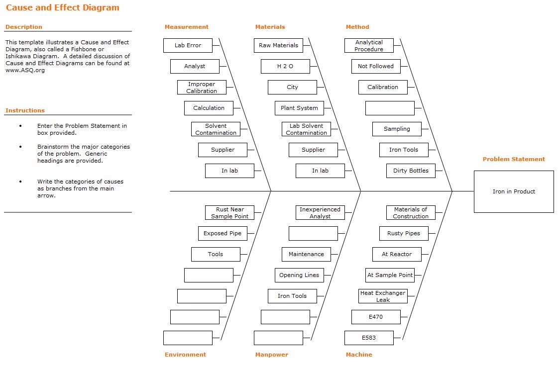
1. Define the Problem Statement
Write the issue clearly at the head of the diagram.
Example: “Iron contamination detected in product.”
2. Identify Major Cause Categories
Typically, causes are grouped into six categories, also known as the 6Ms of Ishikawa:
-
Measurement (e.g., lab errors, improper calibration)
-
Materials (e.g., raw materials, supplier issues)
-
Methods (e.g., procedure not followed, incorrect analysis)
-
Machines (e.g., faulty equipment, heat exchanger leaks)
-
Manpower (e.g., inexperienced staff, human error)
-
Environment (e.g., dirty bottles, rusty pipes)
3. Brainstorm Possible Causes
Under each category, list all potential contributing factors. The more detailed, the better.
4. Prioritize and Analyze
Once the diagram is complete, review the potential causes with your team. Highlight the most likely root causes and test them to confirm before taking corrective action.
Real-World Examples of Causes
Here are some sample causes from our template that illustrate how problems can arise:
-
Measurement: Lab error, improper calibration, miscalculation
-
Materials: Contaminated raw materials, unreliable suppliers
-
Methods: Analytical procedure not followed, incomplete SOPs
-
Machines: Heat exchanger leaks, exposed or rusty pipes
-
Manpower: Inexperienced analysts, lack of training
-
Environment: Dirty sample bottles, rust near collection points
By analyzing causes this way, you can target corrective actions with precision.
Industries that Benefit from Cause and Effect Diagrams
-
Manufacturing – Reduce product defects and improve production efficiency.
-
Healthcare – Identify root causes of patient safety issues or treatment delays.
-
Supply Chain – Analyze bottlenecks and delivery failures.
-
IT & Software – Troubleshoot recurring system errors and bugs.
-
Laboratories – Ensure accuracy in testing by addressing contamination or calibration issues.
Download Our Free Cause and Effect Diagram Template
To save you time, we’ve designed a professional Excel template that you can edit and customize for your projects.
👉 [Download the Cause and Effect Diagram Template (Excel)]
This template includes:
-
Pre-formatted Fishbone Diagram layout
-
Clear instructions for use
-
Editable branches for categories and sub-causes
-
Ready-to-print professional design
Frequently Asked Questions (FAQs)
1. Is a Fishbone Diagram only for manufacturing?
No. While it originated in manufacturing, it’s widely used in healthcare, IT, education, and service industries.
2. What’s the difference between a Fishbone Diagram and a 5 Whys analysis?
A Fishbone Diagram maps multiple causes visually, while the 5 Whys method drills deeper into a single cause. They are often used together.
3. Can I use this template in Google Sheets?
Yes. The Excel file can easily be uploaded to Google Sheets for online collaboration.
4. How do I know when I’ve found the real root cause?
When addressing a cause eliminates the problem consistently, you’ve likely found the root cause.